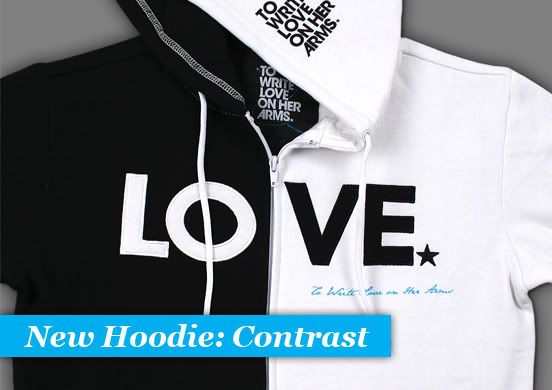
Going all the way back to the original TWLOHA story, contrast is something we think about and talk about. My friend Kory and i aimed for it when we worked on the original (TWLOHA) Title logo three years ago. It’s the reason we chose black and white. To represent pain and hope. Addiction and sobriety. Our dreams and our fears. Life and death. These odd couples and these battles seem to be everywhere – i see them on the news and i see them on the street and i feel them in my chest – and yet they tend to stay as secrets.
We have a new hoodie. It’s black and it’s white and we’re calling it “Contrast”. We might be idealists to the point of believing that a sweatshirt can be more than a sweatshirt, that what we wear can be an expression of what’s important to us and the kinds of conversations we hope to have.
Gavin
How can I order that black/white hoodie
Tnx
Claire Biggs
Hi Gavin, You can order the contrast hoodie here: http://store.twloha.com/collections/guys/products/contrast-love-zip-hoodie?variant=280077178